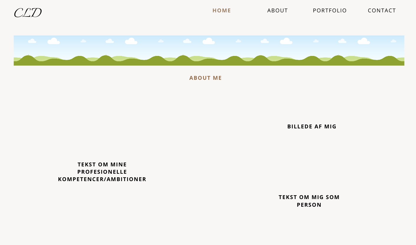
Website Sketch
Web Design
Before creating the website, I considered the overall purpose, target audience, and user experience. The website was designed for potential employers, professional connections, and fellow marketing students who may want to learn more about me and my work. The goal was to create a professional, simple, and easy-to-navigate website where visitors can quickly find relevant information. The design focuses on clarity, consistency, and accessibility to provide a positive user experience across all pages.
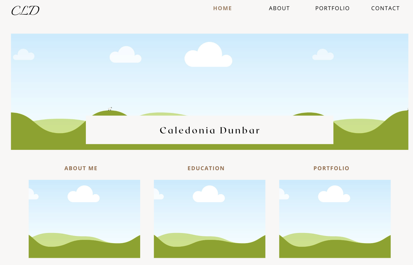
Front Page
The front page is designed with a clean and structured layout that focuses on simplicity, clarity, and user experience. The manu bar at the top provides easy access to the website’s main sections, making the site intuitive and easy to navigate. A large header section is used to create a strong first impression and establish the overall visual identity of the website.
The front page is divided into clear sections such as About Me, Education, and Portfolio, which helps organize the content and gives the user a quick overview of the website’s purpose. The design uses a minimal amount of elements and plenty of spacing to create a calm and modern appearance without overwhelming the user with too much information at once.
The main focus of the design has been to create a balance between professionalism and personality through a simple, modern, and visually accessible layout.
Subpage
The About Me page is designed to create a more personal connection with the user while still maintaining a clean and professional appearance. The layout is kept simple and structured, with clear spacing between the different elements to make the page easy to read and visually balanced. Using the same navigation structure and visual style as the front page helps create consistency across the website and allows users to move between pages without confusion.
The page combines both professional and personal information in order to present a more complete picture of the individual behind the website. One section focuses on professional competencies, ambitions, and educational background, while another section highlights personal qualities and identity. This balance helps create a more authentic and relatable presentation.
A dedicated space for an image has also been included to make the page feel more personal and engaging. The minimalist structure and limited use of elements help maintain focus on the content itself, while the overall layout supports a modern, approachable, and user-friendly design.